Rethinking a camera interface from a blank canvas
In our 1st newsletter, we explained VIEWFINDER’s goal: to bring back the fun and magic to contemporary cameras. This led us to ask ourselves:
How may we create a new camera UX and UI paradigm that seamlessly marries hardware and software?
The answer we came up with was KEIRIN, and it comes with the following three principles:
Reductionism + familiarity + magic
- It is critical to reduce the number of steps, taps, and clicks required to take pictures, whether shooting in fully automatic or fully manual mode.
- A camera should feel intuitive and familiar; the less you need to learn, the easier it becomes to use, and the more you will use it.
- There is no time for boring experiences, and everyone loves magical moments, right?
Contemporary technology + contemporary interface
It is 2023 and, at its best, we still shoot using 20+ years old camera interfaces (opens in a new tab).
Creating a new camera requires a purpose-driven approach that starts by aligning the business, users, usability, hardware, and software goals. Thus, making design decisions on function and differentiation is critical in a market full of options.
Intuitive & familiar interface
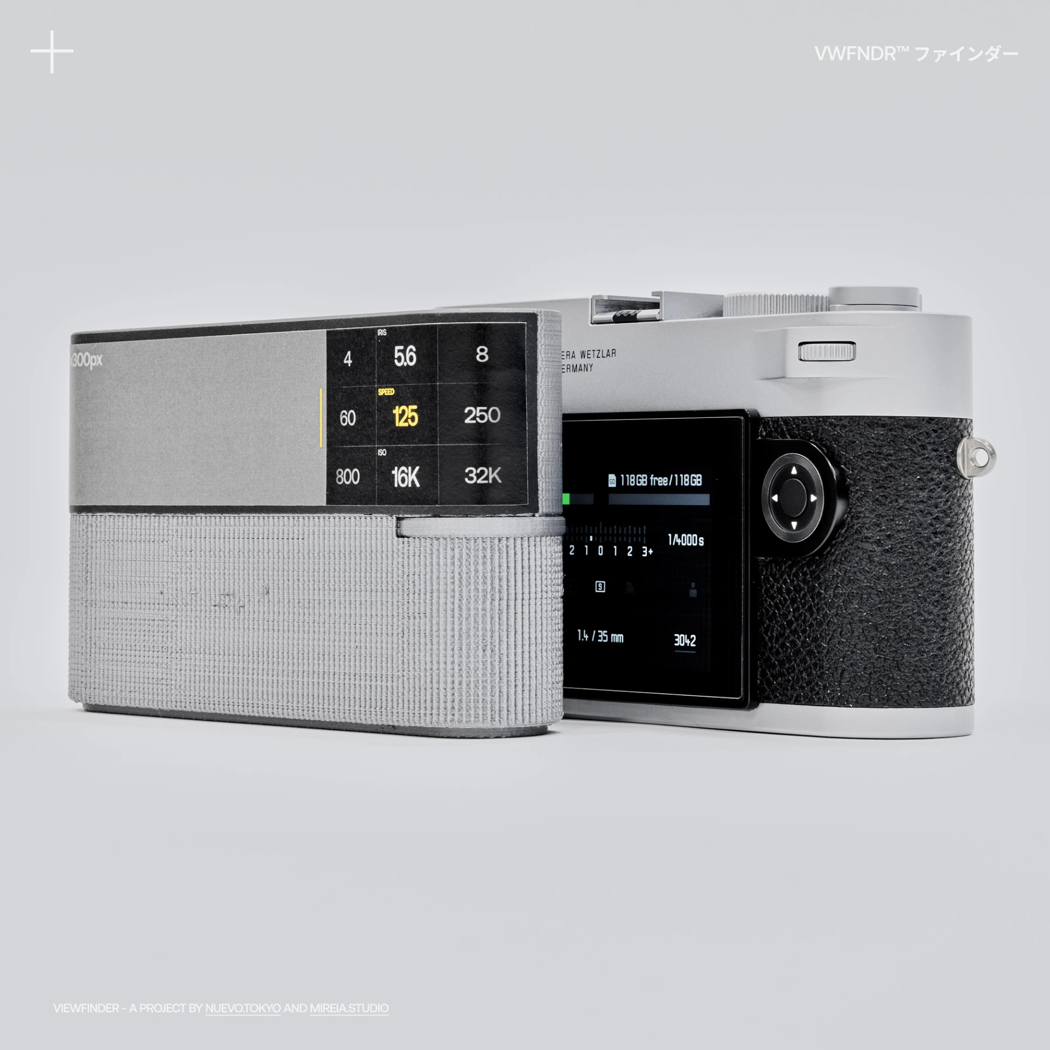
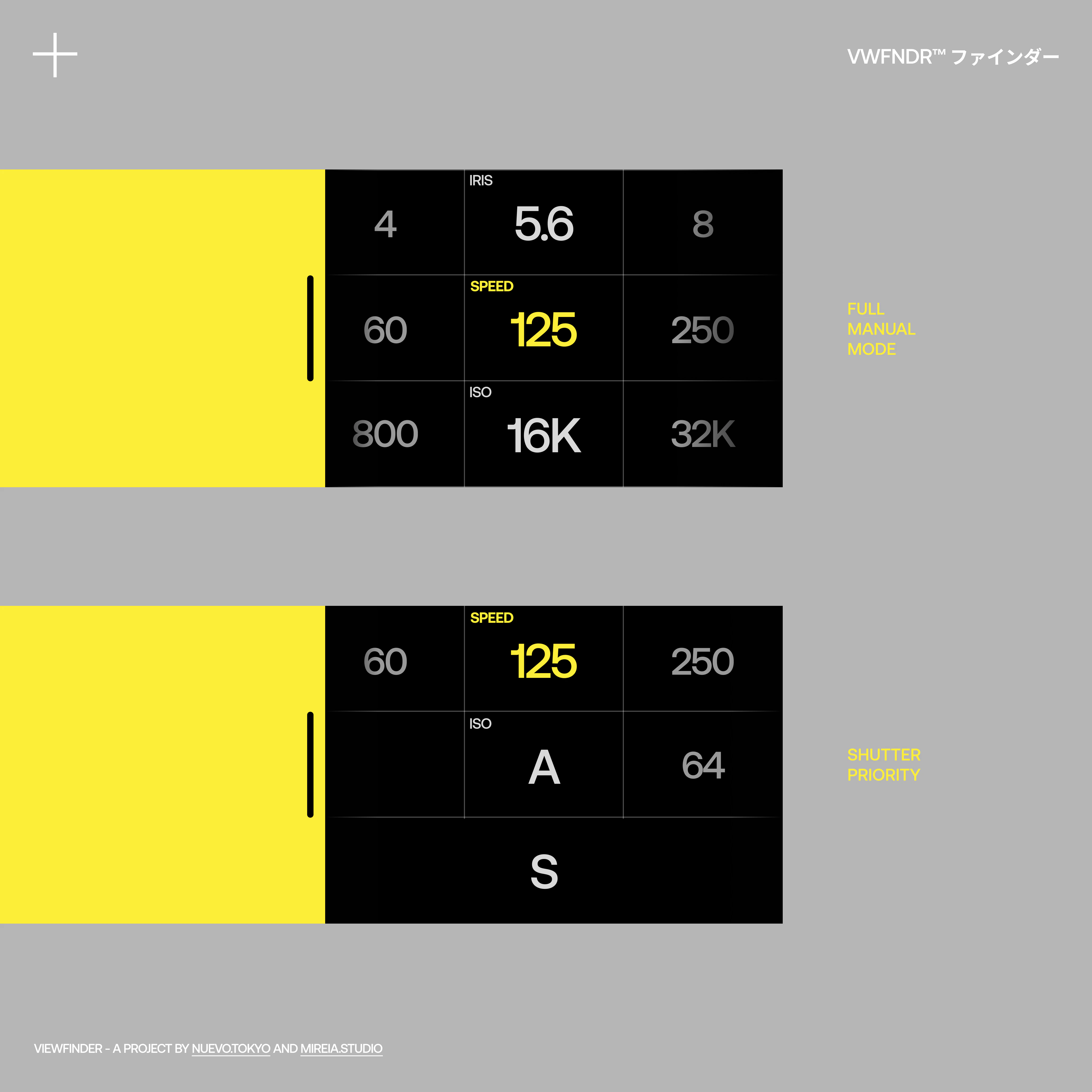
KEIRIN is designed to cater to all levels of users: beginners, amateurs and professionals. Its interface adapts to every need, making it feel and behave like a cutting-edge phone. It also maintains universal photography controls, such as the Exposure Triangle. More information on this topic can be found in Part 2.
Physical buttons and/or touch screen
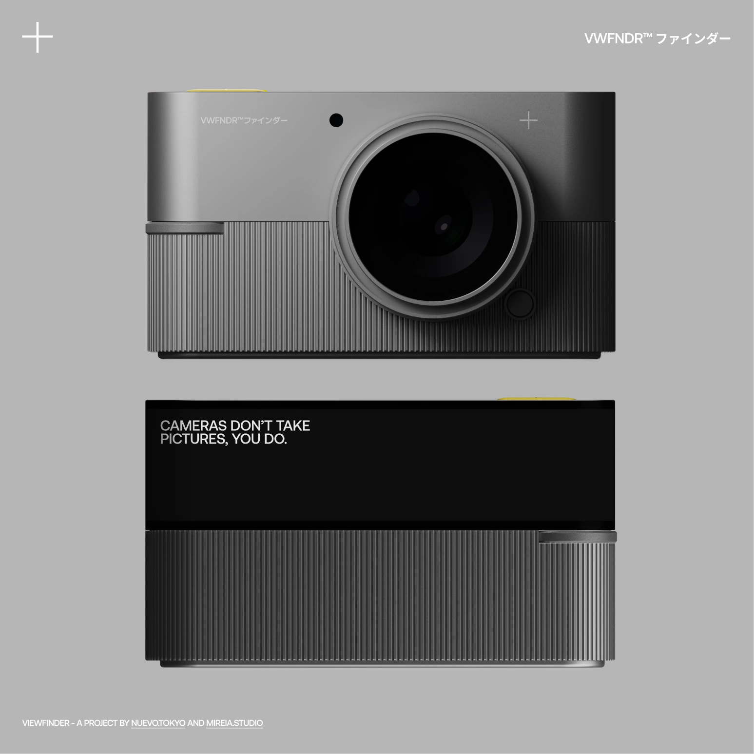
We explained the reasoning behind the reduction of physical buttons for KEIRIN in our previous newsletter: we wanted to leave just the minimum-necessary physical buttons. Each of them has a specific function, and all of them can be customised.
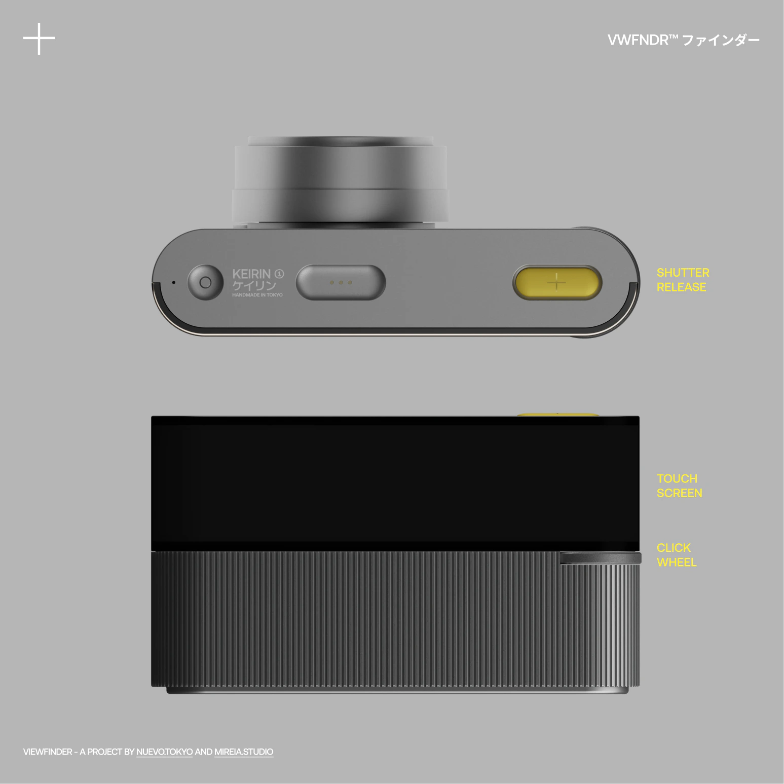
There is an intentional “function redundancy” between the on-screen options and the physical buttons. For example, you can either use touch-and-swipe gestures on the screen or click-and-rotate the wheel to select and adjust a specific setting value. As shown in the GIF below, you can click the wheel back and forth to navigate up and down the menu.
Multi-button press combinations will also be used for specific instances, such as restarting the camera for firmware updates or power cycling as the camera rests in sleep mode.
Screen size & touch real estate
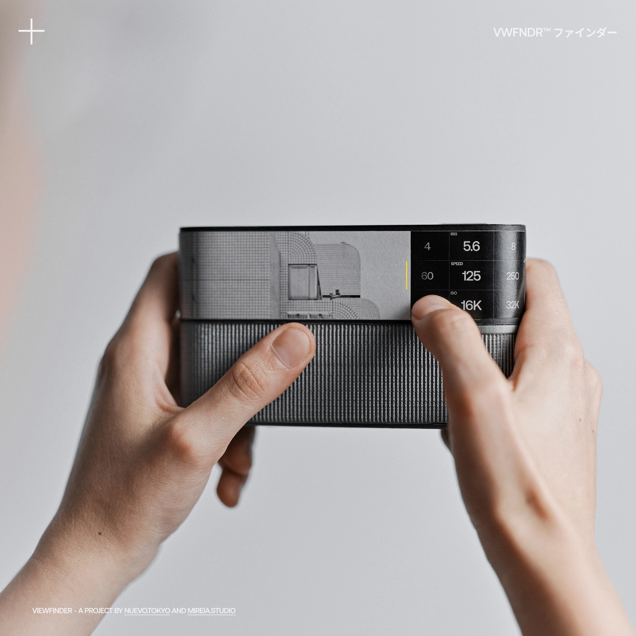
KEIRIN's screen is unique, with its curved edge and super-wide aspect ratio. From the beginning, we aimed to display the viewfinder's live view and the camera settings both in view without overlapping each other, unlike most cameras available in the market today.
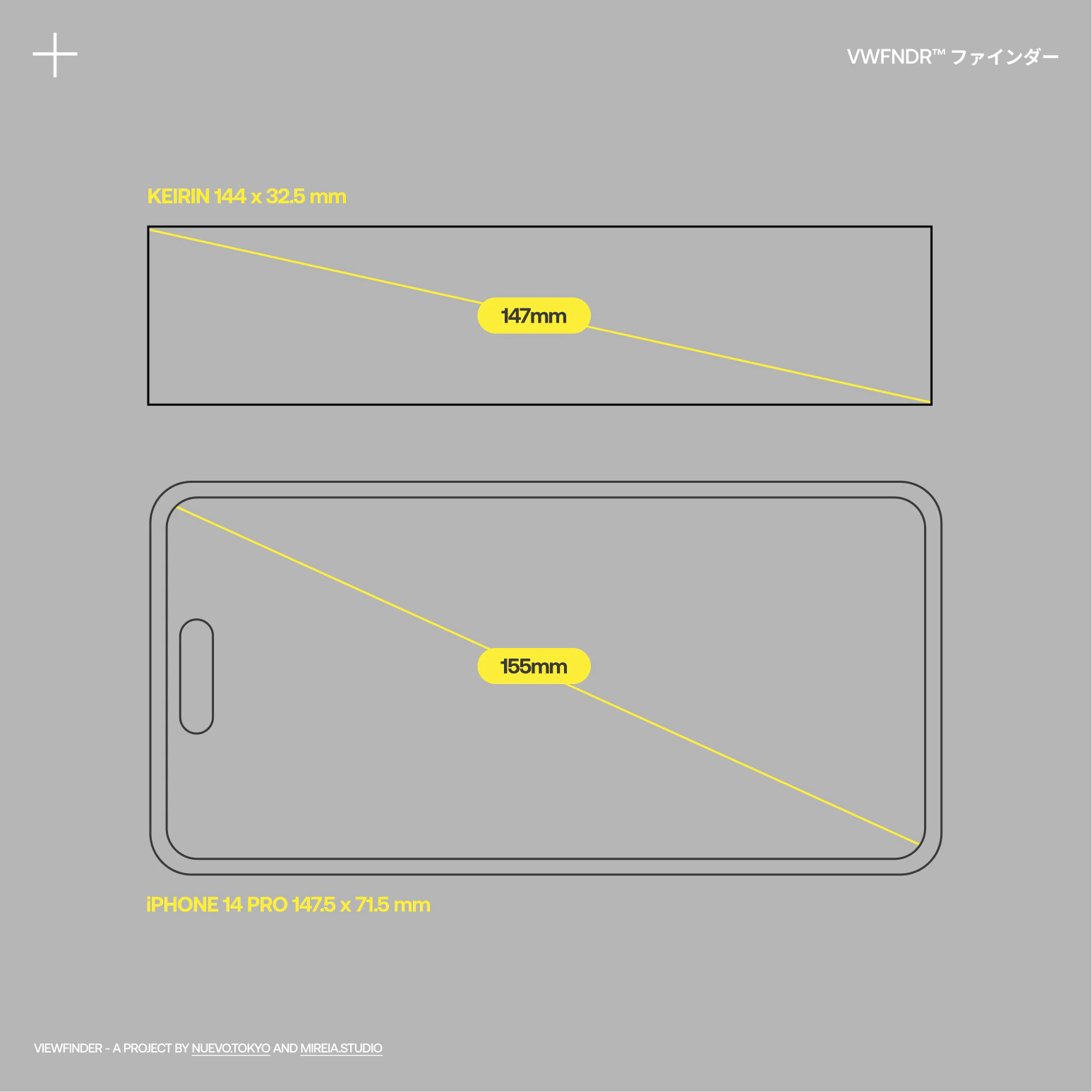
A touch screen should feel and behave similarly to the latest mobile phones. However, most current camera touch experiences are clunky and frustrating due to poor refresh rates and UIs that were not designed to be used with fingers from the start.
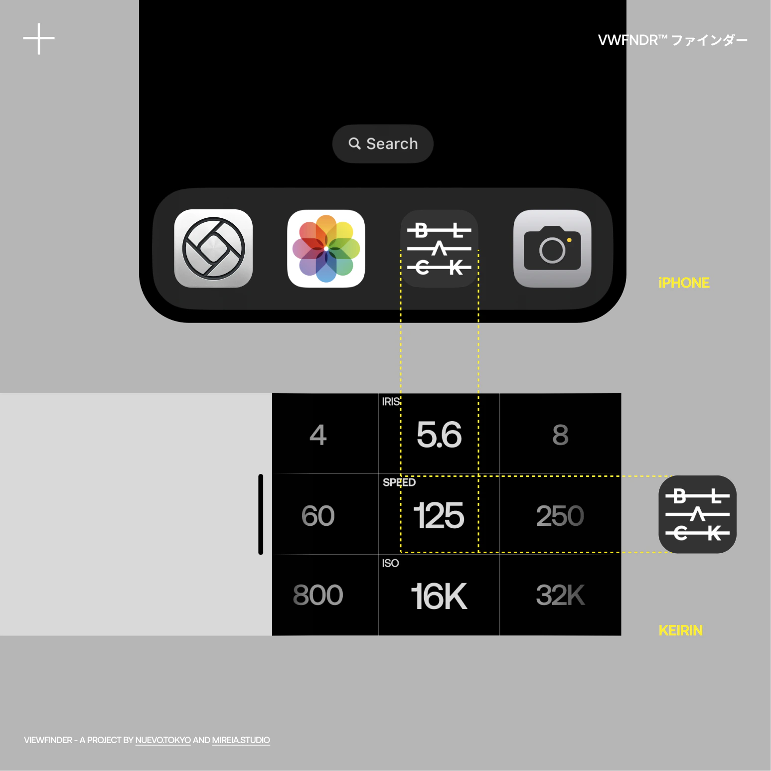
A well-designed and implemented camera user interface can be used effectively with touch-only or in combination with physical controls.
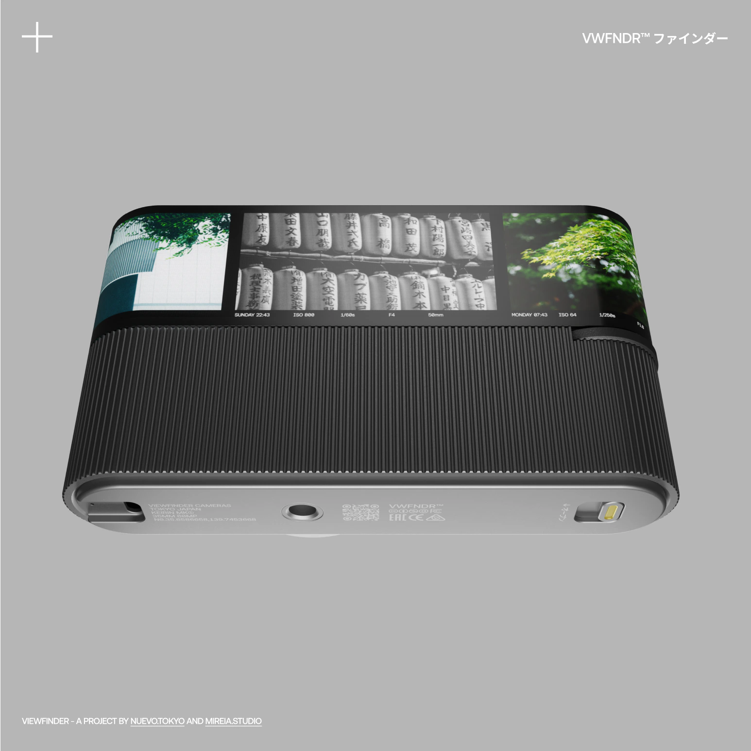
A bit of magic: photo gallery, aka “film strip”
Do you remember film strips? And the beautiful way they looked when viewed on a light table or against the sun. They were effectively timelines of the photos taken. There's something truly magical about positive film photos, and we wanted to capture that same feeling on KEIRIN.
When swiping right from the live-view to access the gallery, the photos will move side to side as if they were a film canister loaded in the camera.
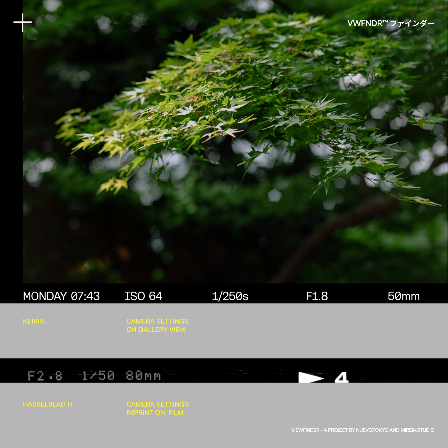
Imprinting camera settings onto film is a rare feature found only in a few professional cameras. It allows you to record the chosen values for future reference.
Nowadays, it's common knowledge that all cameras include a vast amount of metadata in every photo file, using what is called EXIF (Exchangeable Image File Format). However, not many cameras display this information on the camera itself. We think that having this information embedded in KEIRIN’s “film strip” would be greatly appreciated by many people.
Credits
Thank you to our man Christoffer Morales (opens in a new tab) in Sweden again for his smooth animation work!
VWFNDR™ is an open project for like-minded creators passionate about photography. Please get in touch below with feedback or to get involved!
VIEWFINDER, a project by Nuevo.Tokyo (opens in a new tab) and Mireia.Studio (opens in a new tab)
UX/UI/ideation → Alvaro Arregui Falcon
Industrial design/ideation → Mireia Gordi i Vila